
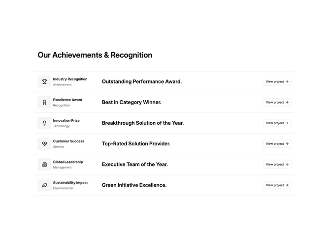

List 2 block design & features
List2 is a vertical stack of items separated by Shadcn UI Separator lines, topped by a large heading. Each row is a four-column grid containing an icon inside a muted square, a title with a category subtitle, a large-font description, and an outline Button with an arrow linking to a detail page. Separators run above and below every item.
Icons sit inside compact rounded containers with muted fill, keeping them visually anchored. The description column uses oversized semibold text that dominates the row and draws attention. Buttons use outline styling with a right-arrow icon appended. Spacing is generous between rows thanks to the padding around each separator-bounded item.
The overall look is structured and portfolio-like, placing emphasis on short punchy descriptions rather than extended copy. Complexity is low because all data is static and the only interaction is clicking the view button on each row. You supply an array of item objects with icon, title, category, description, and link.
On mobile the grid reorders: the description floats to the top of each item, followed by the icon and title group, then the button aligns to the right edge.