
Timeline 3 block design & features
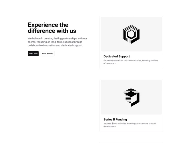
Timeline3 is a two-column timeline built with shadcn/ui. The left column pins a large heading, a supporting paragraph, and two buttons: a filled Start Now action and an outlined Book a demo action. The right column stacks four rounded cards. Each card holds a 16:9 image with a dashed inner border, then a title and a short description. Sample entries read like company milestones: Dedicated Support, Series B Funding, Product Launch, and Company Founded.
Cards sit on a light surface with a hairline outer border and extra inner padding around the image. Titles are large and semibold. Descriptions are muted. The sticky intro is spacious, with a large headline and roomy gaps before the buttons. The dashed image frames read as placeholder wells. The section is static, with no motion.
Overall this is a standard sticky-scroll milestone layout with a basic, placeholder look. The dashed image frames and stacked cards are the main visual cue. Complexity is moderate and mixed: you need a heading, intro copy, two CTA labels, and several milestone images with titles and blurbs. It is more of a company story wall than a dated event list.
On smaller screens the columns stack, so the intro scrolls away before the cards. The buttons sit in a column first, then side by side at larger widths.