Banner 1 block design & features
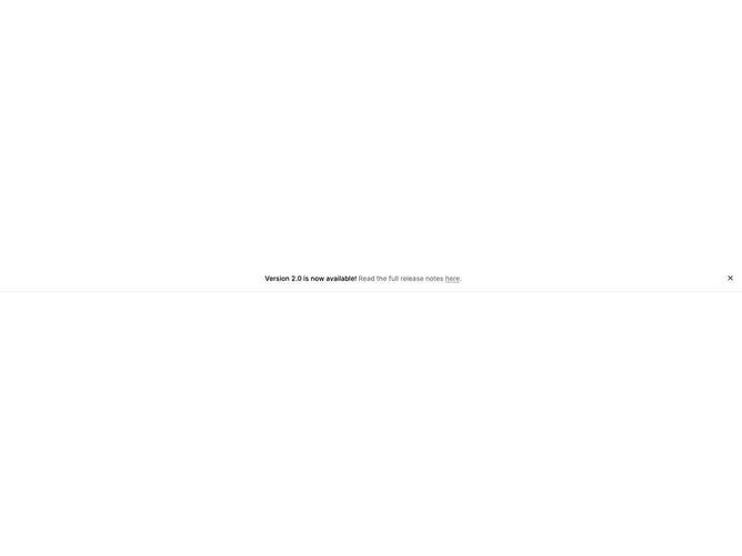
Banner1 is a narrow horizontal strip built with Shadcn UI Button for dismissal: full viewport width, background matching the page, a bottom hairline border, and modest vertical padding. The middle flex region centers a single inline sentence that combines a semibold title, muted descriptive text, an underlined link that opens in a new tab, and a trailing period, while a square ghost icon button sits at the end of the row for closing.
Showing and hiding is handled locally: when closed, the section returns null so the banner unmounts for the session unless you lift state yourself. There are no icons beside the message itself, which keeps the row quiet and text-first.
The look is utilitarian and product-announcement oriented, closer to a changelog bar than a marketing hero. Complexity is low and props are limited to strings for title, description, link label, URL, plus an optional default visibility flag.
Because content is one continuous line, very small screens may wrap the sentence; the flex layout still keeps the dismiss control pinned on the same row as far as flex rules allow.