A Premium Shadcn Figma Kit with Hundreds of Pro Blocks.
Design faster and smarter with the new Shadcnblocks Figma Kit. With hundreds of new block designs, every component is crafted for consistency, responsiveness, and seamless integration with shadcn/ui. Each block includes a direct link to the code version, making it easy to collaborate to transition to code.
 Figma Preview
All Shadcn UI Base Components
Access every Shadcn UI component as Figma components, ready to use in your designs with consistent styling and behavior.
500+ Pro blocks
Jumpstart web designs with hundreds of our blocks pre-designed in Figma. Desktop and mobile versions. Easy to customize, duplicate and enhance. We add new blocks every month.
Complete Theme System
Includes comprehensive theme variables, light/dark mode, compatible with shadcn css variables and tweakcn themes. Tailwind text styles, scales, color palettes, and icon sets for consistent design across your projects
Design System ComponentsBlocks
Includes all the base shadcn/ui components in Figma
From buttons to dialogs, every shadcn/ui component is available as a Figma component. Design with confidence knowing your designs will match your codebase perfectly.

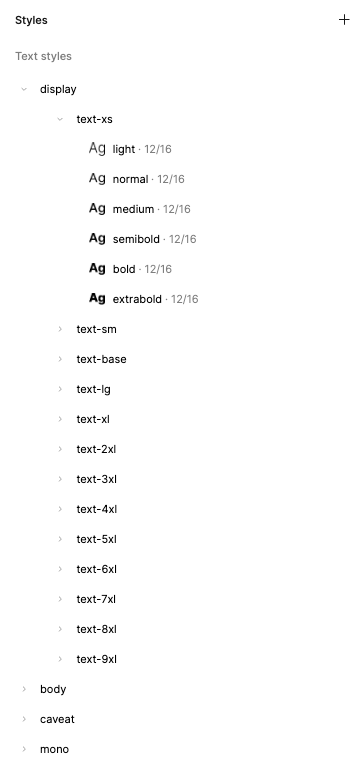
Tailwind Text Styles
Text styles that map to tailwind classes with all Tailwind variables for font, weight, size, leading, tracking, etc. We support Display and body fonts at the theme level.

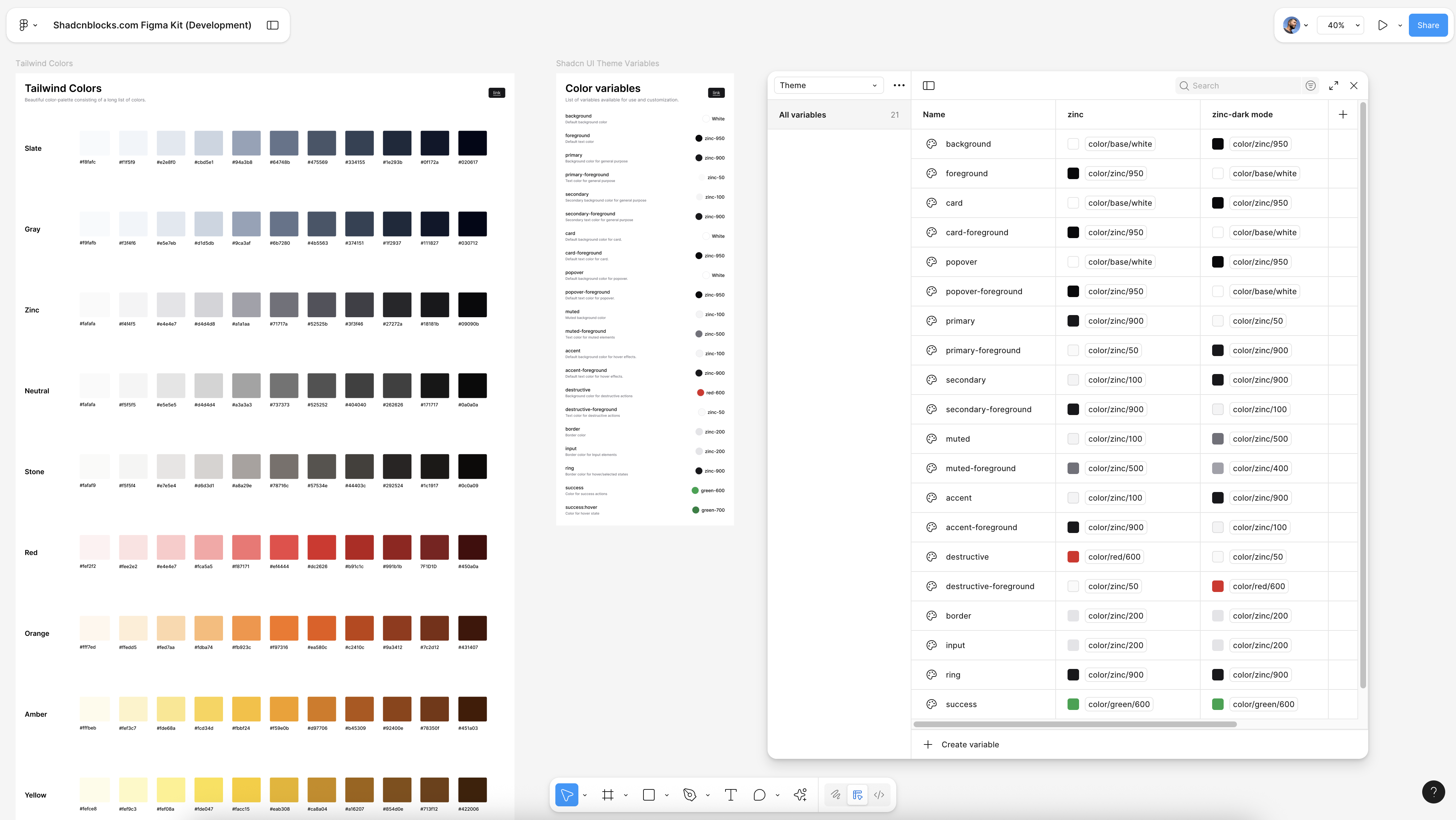
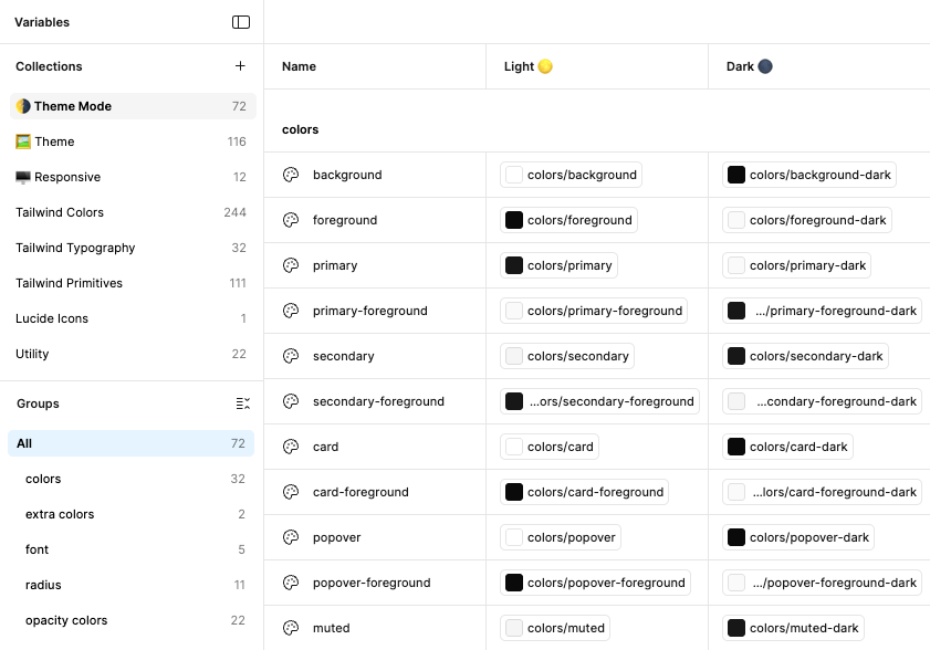
Tailwind & Shadcn Theme Variables
Includes Tailwind color palette, shadcn theme variables, typography scale, spacing system, and component tokens. Everything you need to maintain design consistency.
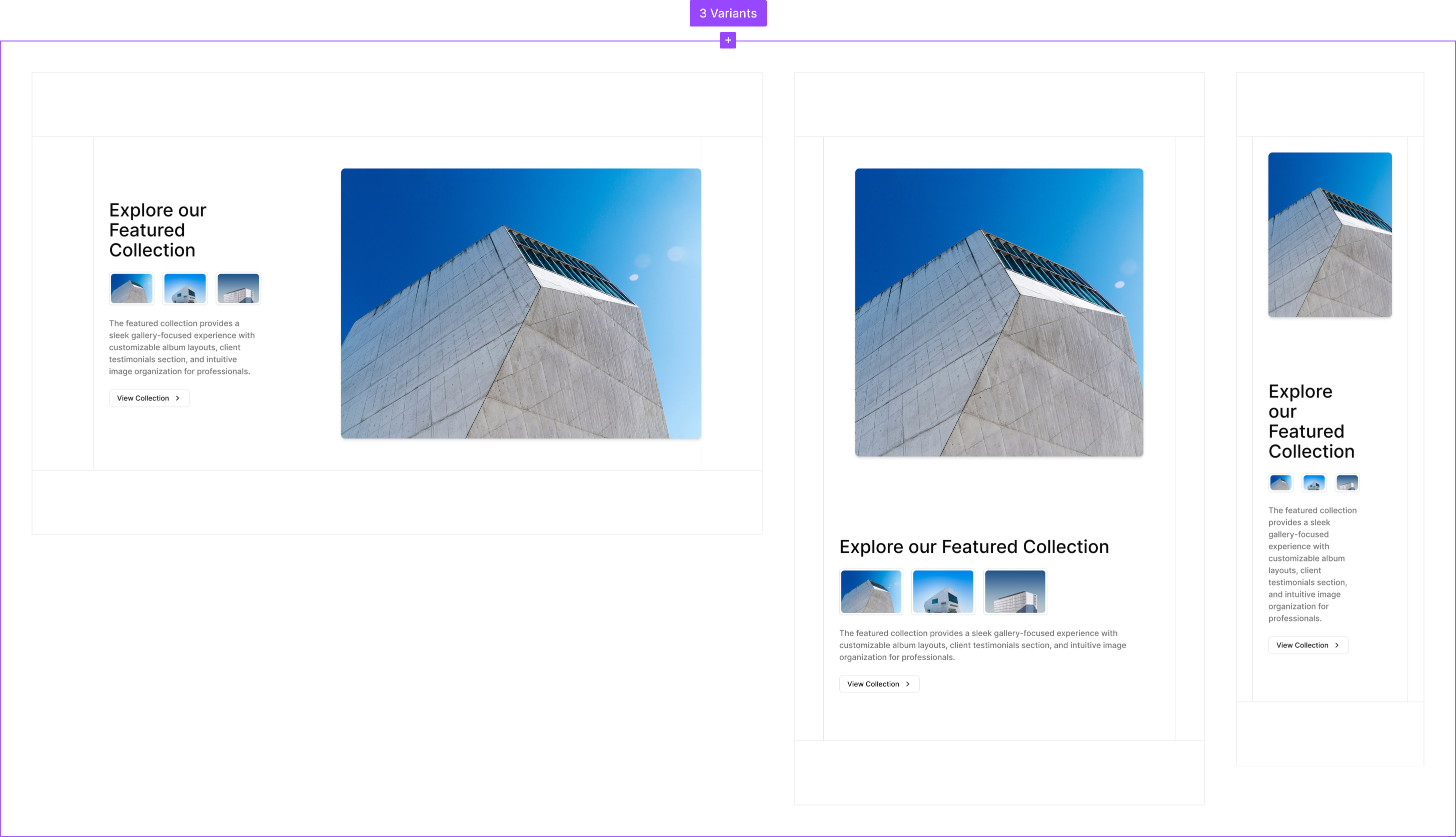
500+ Pro blocks
Hundreds of our Pro Shadcn blocks meticulously crafted in Figma. Each block uses shadcn/ui variables and shadcn components. The blocks are also built as components so you can select and swap blocks from the asset library. Every block has responsive designs for Desktop, Tablet and Mobile views.
Light/Dark Mode
Every component and block is designed with both light and dark mode in mind. Switch mode instantly.
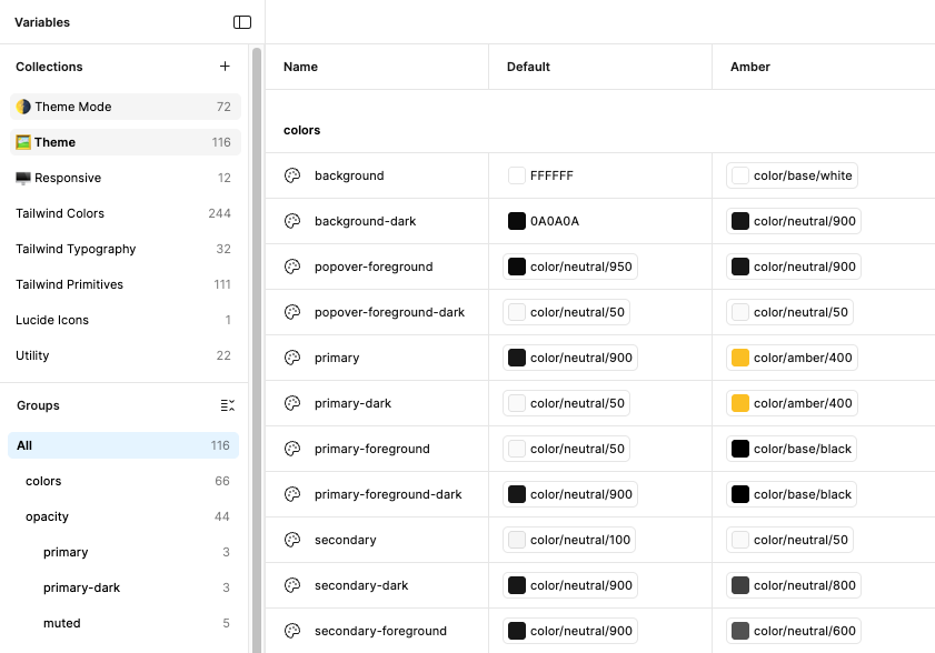
Theme Variables
Customize your design system with theme variables. The kit comes with the default shadcn theme and an example Amber Minimal theme. It's easy to add your own theme or other themes from tweakcn. We use the exact shadcn and tweakcn theme variables.
Tailwind & Shadcn Theme Variables
We've used variables for Tailwind colors, text, padding and margin. We use official shadcn theme variables (like primary, foreground, muted) etc. These are same css variables we use in all of our coded blocks, so any designs will translate into code without changing design system.