Feature 108 block design & features
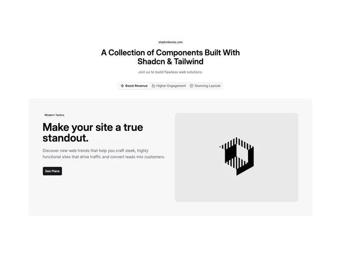
Feature108 is a tab-driven marketing section built with Shadcn UI. The hero band centers an outline badge, a large heading slot, and muted description text. Underneath, a horizontally scrollable tab list presents three triggers that pair a Lucide icon with a label (defaults mention revenue, engagement, and layouts). The active tab reveals a wide muted panel with generous padding containing a responsive two-column layout: left stack shows another outline badge, an oversized title, supporting paragraph, and a large primary button; right column fixes a rounded rectangular image with fixed height breakpoints.
Surface treatment is soft neutral fills behind the panel, outline badges that pick up a solid background variant, and crisp typographic scale jumps between heading levels. Buttons sit flush left under copy while imagery anchors the opposite side on wide layouts.
This block is a polished variant of the classic tabbed feature spotlight: each state is essentially a mini landing strip with its own micro-badge and CTA. Complexity sits in content modeling (three parallel narratives) rather than exotic layout tricks.
Two columns collapse to a vertical stack on smaller widths while keeping the padded muted frame intact around the whole panel.