
Feature 82 block design & features
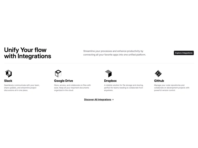
Feature82 is an integration showcase section built with shadcn/ui. The top row uses a five-column grid containing a large balanced heading, a supporting paragraph, and a primary button aligned to the right. A full-width separator divides this header from a four-column list of integration items, each displaying a logo image, a bold title, and a short description. A centered underlined link with a trailing arrow icon sits below the grid.
The visual treatment is clean and text-forward. The separator provides clear structural division between the header band and the content below. Typography steps down from a large semibold heading to standard body text in the muted foreground color. Logo images remain small and uniform in size, keeping focus on the descriptive text beside them.
The overall aesthetic is straightforward and utilitarian, relying on spacing and the single horizontal rule rather than cards or borders to organize information. Complexity is low since you supply an array of integration objects with a title, description, and image path.
On smaller screens the header elements stack vertically with centered text, the button centers beneath the copy, and the four integration columns collapse to a single or two-column grid.