
Footer 2 block design & features
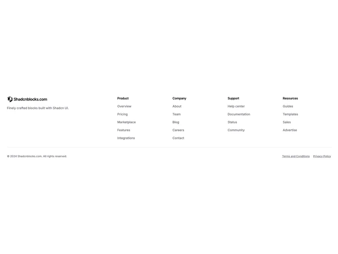
The component uses a six-column grid where the first two columns hold a logo and a brief tagline paragraph, and the remaining columns each contain a titled list of navigation links. A border-top row at the bottom separates copyright text on the left from underlined legal links on the right. The Shadcn UI logo primitive handles responsive image rendering.
Text throughout stays small and muted, with semibold section titles in tight tracking providing clear hierarchy. Link hover states switch to the primary color, while the legal links in the bottom row use a persistent underline. The border between the main content and the bottom row is a single thin line matching the theme border token.
The result is a clean, traditional footer pattern that prioritizes readability and structure over decoration. The consistent spacing and restrained color palette give it a straightforward, professional quality.
Below the large breakpoint the grid drops to two columns, stacking the logo and tagline above the link sections. The bottom row shifts to a vertical stack on narrow viewports, placing copyright above the legal links.