

Pricing 6 block design & features
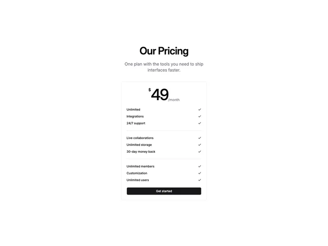
Pricing6 is a single-plan pricing section built with shadcn/ui, centered under a heading and subheading. A bordered card sits in the middle of the page, displaying an oversized price with a small dollar sign and period label, followed by grouped feature lists separated by horizontal dividers, and a full-width CTA button at the bottom.
The price numeral uses large, tightly tracked type while the currency mark and period text sit at smaller sizes beside it. Feature rows are laid out with the label on the left and a check icon on the right, keeping each line scannable. Separator components divide the feature groups within the card, giving structure without adding heavy borders.
The overall feel is minimal and focused, built around a single plan rather than tier comparison. Complexity is low because you supply one price, one button, and an array of feature groups. The card border and centered alignment give it a contained, clean presentation.
On smaller screens the card stretches to full width while preserving the same stacked layout of price, features, and button.