
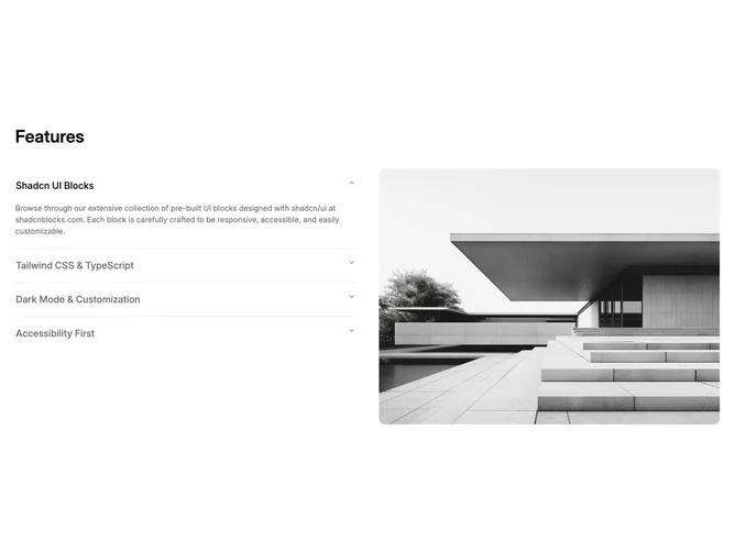
Feature 197 block design & features
Feature197 is a two-column feature section built with shadcn/ui. The main column is an accordion: each item exposes a headline and supporting text while a companion column holds a single media frame that changes to match the open item. The pattern reads as “pick a topic, see it illustrated” rather than a static grid of cards.
The surface stays light with dark type, generous vertical rhythm between accordion rows, and a rounded or card-like treatment around the image side so the media reads as a focused preview. Typography is headline-first inside each expanded panel with shorter supporting lines. Interaction is limited to accordion expand and collapse plus the implied image swap, so motion stays subtle.
This is a moderate-complexity marketing pattern: one hero image slot per feature plus parallel titles and descriptions for every row. It works well when you have a small set of capabilities that each deserve their own screenshot or diagram. The accordion keeps the page shorter than stacking every feature with a full-width image pair.
On smaller widths the layout stacks so the list and image still follow one another in a sensible order, with the image typically reinforcing the item the user last opened.