

Gallery 4 block design & features
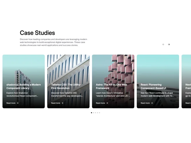
A header row pairs a title and description on the left with ghost-variant arrow buttons on the right, followed by a shadcn/ui Carousel whose track bleeds past the container edges on ultra-wide viewports. Each slide renders a tall card where a background image fills the frame, a dark linear gradient overlays the lower portion, and white text layers the title, description, and a "Read more" link over the gradient.
The image scales up on hover with a CSS transform, and the arrow icon beside the link nudges rightward on group hover. Below the carousel, a row of small dot indicators marks each slide's position, with the active dot filled at full primary opacity and inactive dots at 20%. Clicking a dot scrolls directly to that slide. On smaller screens the carousel switches to drag-free mode for swipe navigation.
The approach is magazine-cover-style, treating each card as a self-contained visual story with overlaid text. The dark gradient ensures readability regardless of image content, and the dot pagination adds a familiar navigation pattern that complements the arrow controls.