Shadcn UI Gallery Block
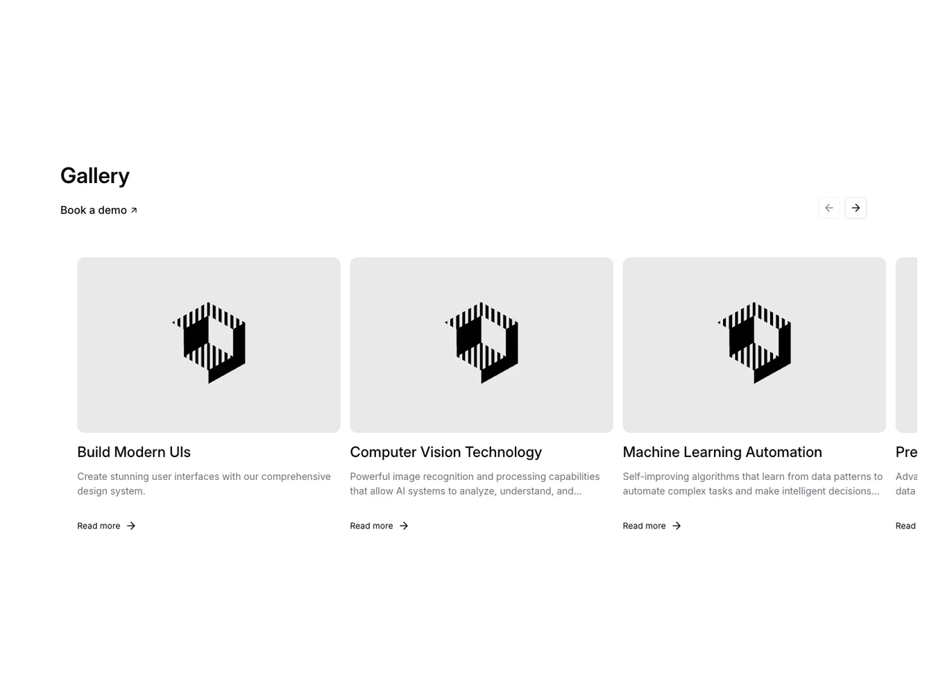
The Gallery6 component is a dynamic and interactive carousel designed to showcase a collection of gallery items, each displaying a title, summary, and an image. This shadcn ui component enhances user experience by integrating navigation controls and a demo booking link, presenting user-friendly content in a visually appealing, organized layout.
In greater detail, Gallery6 leverages advanced carousel features from the shadcn ui library. The component manages internal state to enable seamless scrolling functionality through its items. It adapts to screen sizes and supports smooth interactions with modern, minimalistic aesthetics. Users can navigate through carousel items effectively with arrow buttons that update according to the carousel's state. The component further enhances interactivity by featuring hover effects on images and links, encouraging user engagement.
Dependencies
| Package | Type |
|---|---|
| lucide-react | NPM |
| react | NPM |
button @shadcn | Registry |
carousel @shadcn | Registry |
