Hero 32 block design & features
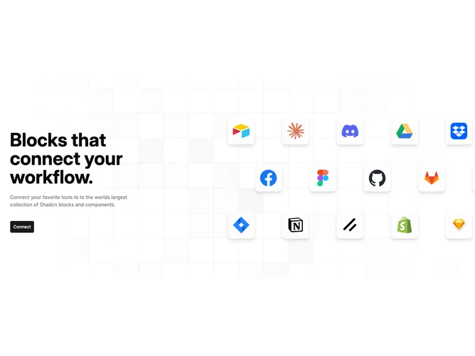
Hero32 pairs narrow left-column storytelling from props with an expansive masonry of integration logos rendered as elevated squares with muted interiors and crisp borders. The single prominent shadcn/ui button keeps conversion paths obvious while the right-hand waterfall sells breadth.
Behind both halves, a softened square lattice fades toward the edges so depth stays subtle.
Alternate rows shift horizontally to imply motion even though tiles are static.
On medium layouts the text column overlaps slightly into the masonry lane via negative spacing tricks, so the composition feels intertwined rather than purely split.