Pricing 2 block design & features
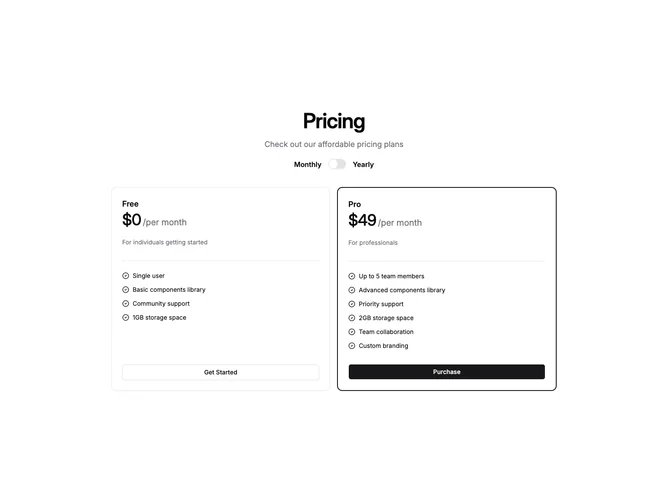
Built with shadcn/ui Card, Separator, Switch, and Button components, this block opens with a centered heading and description followed by a prominent Monthly/Yearly billing toggle. Below the toggle, two pricing cards sit side by side on desktop and stack vertically on mobile. Each card displays the plan name, a large price with cadence suffix that updates when the toggle changes, a short plan description, a horizontal separator, an optional feature-list heading, and a vertical checklist with CircleCheck icons and a full-width CTA button.
The visual treatment is clean and restrained. Cards have no shadow and use a single hairline border by default, with the highlighted plan switching to a thicker primary-colored border to draw the eye. Typography establishes hierarchy through size and weight alone, and all colors come from theme tokens so the block adapts to any palette in both light and dark modes.
Overall this is a straightforward, low-decoration pricing comparison that follows standard shadcn marketing patterns. Complexity is modest: the only interactive element is the billing switch, which toggles price and cadence text on both cards simultaneously. It works well as a reliable default when two tiers and a clean card layout are all that is needed.