Description of the Signup 2 block design & features
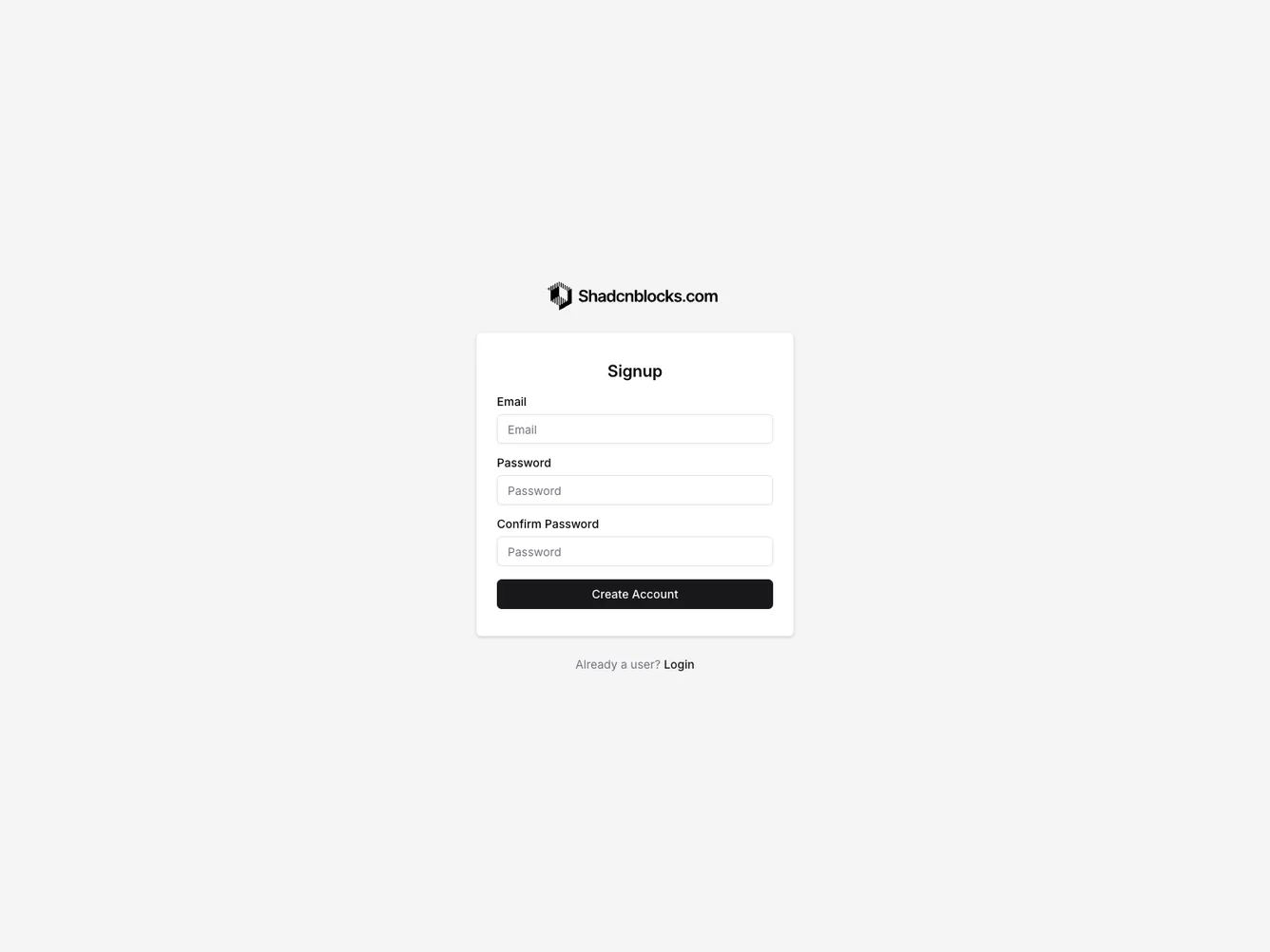
The Signup2 component provides a streamlined, user-friendly interface for new user registration. It incorporates essential elements like a logo, form fields for user input, and a call-to-action button, all arranged within a visually cohesive layout. The component is versatile, offering props that allow customization of text elements to match the branding needs of any application. By implementing consistent spacing and alignment, it ensures that the signup process is easily navigable for users, enhancing their overall experience.
Expanding further, the Signup2 component stands out as a shadcn ui block designed for applications looking to leverage a simple yet effective signup process. The design encapsulates a balance between aesthetics and functionality, making it adaptable to various contexts. It includes form fields for email and password creation, which are crucial for user account setup. The component also integrates a logo display area, providing an opportunity for brand reinforcement. It supports customizing button text and signup prompts, which enhances user interaction by making the component feel more personalized and relevant to their needs.